Drug Pricing Tool
Background
Note: I have modified or simplified certain details, as these changes have not been fully released yet. I would be happy to walk through the full process and outcomes in an interview.
Project Background:
PRX is a drug pricing lookup tool, where users can search and filter a huge database of drug pricing history. A typical user might be a researcher who is releasing a new drug soon, and wants to compare pricing for similar products.
Problem:
The tool was quite old, and out of date with current branding guidelines. Based on user feedback, it was also very confusing and cumbersome to use, especially for new users.
Project Goal:
Update key sections of PRX to add functionality, improve the general structure and navigation, and simplify workflows, to create a more efficient and intuitive tool for users.
My Role: Lead Designer. I worked closely with the product manager and a subject matter expert, to understand the tool’s functionality and user pain points.

Research and Discovery
Learning the tool:
To begin, I walked through the pricing tool as a user, with the product manager and a subject matter expert (SME). This allowed me to not only learn the tool, but also experience it as a new user, and understand areas of confusion and pain points.
User interviews:
We then conducted 9 internal interviews, to gather more data and confirm suspected user pain points. These were primarily with users in sales and marketing, who were familiar with the tool but also worked closely with new and existing customers. They gave us valuable feedback on both their own experience, and feedback they’d gathered from years of training users.
We also had one extremely valuable interview/walkthrough with a new hire, who was unfamiliar with the tool, and we were able to watch firsthand where he struggled, and his first impressions.
Data synthesis:
After completing interviews, I worked closely with the PM and SME to create a list of suggested changes and requirements.
Key Change: Navigation and Menu
Problem:
The main navigation (top menu) was disorganized, making it difficult for users to scan and find the item they needed. The main action items (search, filtering, alerts) were combined with account items (preferences, etc.).
The filtering items were confusing to users, and there was not a quick way to access their combined filtered data (users could only access it from one of the filter pages).
Solution:
I reorganized the menu into two groups: main actions, and account related options.
The main actions were organized by typical user workflow: starting with search, filtering, and then alerts based on the filtered data.
I added an option for the combined filters page, where users could see their final dataset, allowing them quick and simple access to this crucial page.
We also felt that seeing the 3 filters pages in the menu, in order of workflow, would help users understand the typical flow of data filtering.
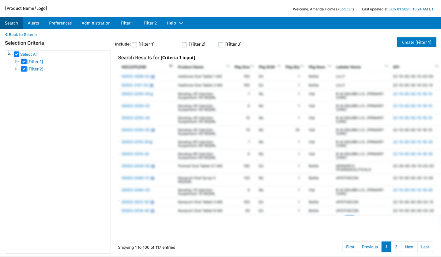
2. Search Results
Problem:
In the current (old) workflow, users would choose from a list of multiple search criteria and enter their search input on the search page (homepage). Then they were brought to the search results, where they could narrow it further.
However, if they wanted to search a different criteria, they would have to return to the search page, adding time and effort to the process.
Solution:
We felt that it would be more efficient to allow users to edit their search and do a new search on the same results page. This is also consistent with typical search engines (such as Google), so is expected behavior.
I redesigned the search results page to show the search criteria, and any further filters, in the left panel. Users can modify their search, or select a new criteria from the dropdown to start a new one.
This creates a more streamlined and efficient process for users, who are often trying various searches to access the data they need.
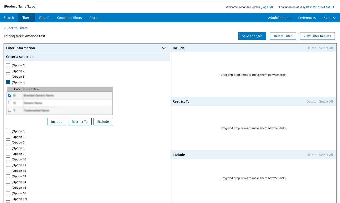
3. Data Filter
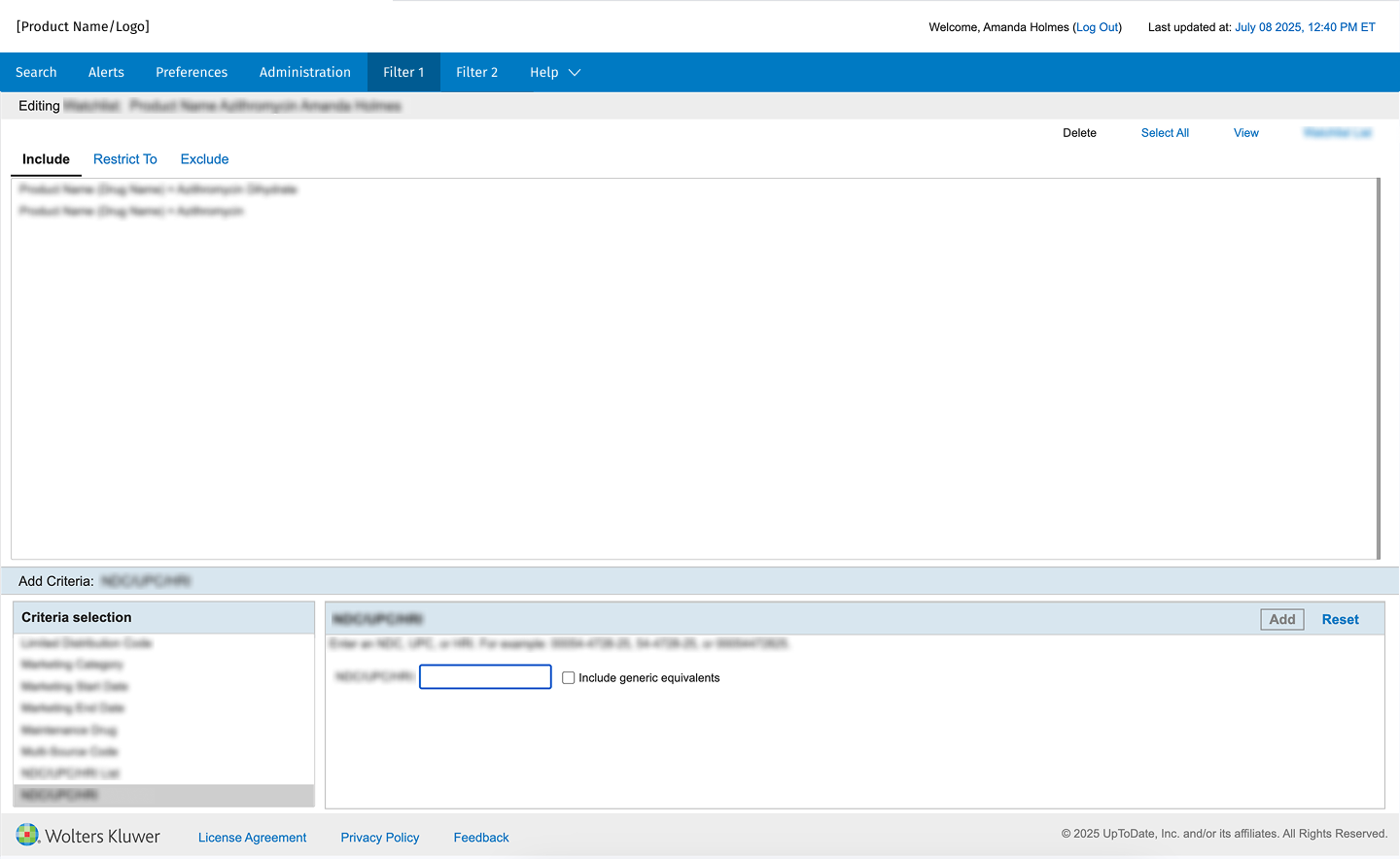
Summary: The Filter page is one of the most crucial sections of the platform. This is where users select criteria to filter their data, to help create their final data set. It is also a key step in the overall workflow, so redesigning it also helps users to understand the tasks needed to use the platform.
Concerns:
Add New vs. Edit:
The pages for Add New and Edit had different designs, and functioned differently, leading to confusion for users. The workflow was also clunky- users had to Add New, input a couple fields, then select Edit, to go to the Edit page.
Edit page:
There was a tiny area for the (very long) criteria list, which users must scroll through. This was below the list of chosen criteria, which was confusing (generally users expect interactions to go left to right, or top to bottom).
Users can add criteria to three lists (include, exclude, restrict to). These lists were shown as tabs, so users could not see all the items at once, and interactions were clunky (deleting, reordering, etc.).
Solution:
I combined the Add New and Edit pages into one design (either blank, or prefilled if they are editing). This reduces confusion by giving users a consistent experience.
I redesigned the Add/Edit page as a column design, where the criteria list is on the left, and uses most of the vertical space on the page. Selected items are displayed on the right, with all three lists displayed. Users can drag/drop items between lists, or easily rearrange or delete them.
This helps users to understand the flow of the page, and to quickly scroll through the criteria list and select items. They can see and edit their selected items clearly, both in the criteria list, and the selected lists.
Results and Impact
Estimated Impact:
While the changes have not been fully released, we estimated a strong impact in both efficiency (time on task), and decreased confusion and learning time, such as:
Reduced time on task by 10-20%
Fewer/shorter training sessions for new users
Fewer customer support tickets
At a high level, this project was also an important step in modernizing and refreshing an older tool, leading to more user engagement and a higher subscription rate